3 Steps to improve your checkout abandonment for Peak Season
As Peak Season is just around the corner, now is a great time to review your checkout abandonment rate.
Online shoppers always expect a simple, convenient and seamless user experience. Whether it’s hidden or obvious, any barrier in your checkout process could make the difference between a customer completing their purchase on your website or abandoning it. Shopify found that a long and complicated checkout process’ accounts for 18% of cart abandonments.
Although it can be easy to get caught up with introducing new products and seasonal marketing, taking the time to review your checkout abandonment rate and understand your user journey should be top of your list. It could highlight new ways to maximise revenue and encourage more repeat purchases.
Having helped hundreds of leading ecommerce brands accelerate their online growth, our team has extensive experience in optimising the checkout process.
What’s a good checkout abandonment rate?
Before we dive into how you can reduce your checkout abandonment rate, you should note that it’s not something that can be completely prevented. Customers change their minds and so you will always have an abandonment rate.
Baynard Insitute found the average checkout abandonment rate was 69.99%. However, as a benchmark, Gocardless claim 40% or less is a good checkout abandonment rate.
Now let’s look at some steps to reduce your abandonment rate.
Step 1: Start with the basics
Before you look at any solutions, always start with your analytics data. A study by Stripe found that the average checkout takes 3 minutes and 95% of websites had at least five basic errors in their process.
Engagement metrics like bounce rate will indicate exactly which pages of your checkout process users are landing on and leaving quickly.
Furthermore, tools like Hotjar provide website heatmaps and behaviour analytics to highlight how your customers are interacting with your site. This will help you to identify the issue and solutions such as changing the structure and content on the page or solving browser specific issues.
55% or higher is classed as high bounce rate and could be a result of one or more of the following:


- Stock and inventory issues – Completing part of the checkout process only to find that the product is not in stock or available will create a negative experience for customers. Always monitor stock and inventory against sales and orders and prepare for an increase in traffic and sales volume.
- Poor user experience – if your checkout process is too complex, not secure, time consuming as customers need to re-enter their details, limited with payment options or inconsistent in the user journey, users will abandon the page and potentially go on to purchase from a competitor. Simplicity, speed and convenience are key components to a good checkout process experience. 87% of online shoppers abandon carts due to a complex process.
- Customer service – Accurate product details, usage information, social proof such as reviews, product videos, FAQs or live chat all help to cement a purchase decision. Exclusive discounts offered at checkout can also entice first-time customers to make a purchase. When monitoring customer reviews, remember to also focus on and respond to negative reviews to show your customers that you value their feedback and are addressing any issues.
- Bugs and issues – If you have reviewed the user experience, stock and inventory and customer service and still can’t find the problem, there may be a bug within your checkout process. Bugs hamper the user experience and cause users to abandon the checkout. Carry out manual and user acceptance testing. Ensure you keep a log of these issues so that they are addressed and resolved.
- Delivery – Delivery information can be easily overlooked. Despite this, delivery options have a huge impact on whether a customer completes the checkout process. Always show delivery options as early as possible and highlight clear prices and times on product detail pages, as well as other incentives such as free delivery if a customer spends over a certain amount. This not only pushes customers to checkout, but also increases average order value.
Step 2: Platforms
There is no denying that the technology and platform your checkout is built on plays a crucial role in checkout abandonment. It can impact loading speed, barriers to entry and the structure of your process.
When it comes to choosing the right platform, select one that not only fits your current needs, but can also adapt as your business grows and evolves.
For Shopify, checkout is a vital part of the customer experience. Shopify’s checkout combined with Shop Pay allows customers to quickly move from purchase intent to order confirmation on any device with its one-tap checkout, in turn, boosting conversions.
Shop Pay stores the customers’ credit card, email, shipping and billing information and populates the fields in the checkout process automatically. It’s safe and secure as data is encrypted and only available to a website when the order is confirmed.
These one-click checkout solutions work especially well for single, big-ticket items where customers have a clear purchase intent, can find the product efficiently and checkout immediately.
Shop Pay has achieved ‘91% higher conversion on mobile and 56% higher conversion on desktop compared to standard checkout’.

Amazon’s Checkout V2 is another checkout solution that works in a similar way. It allows customers to complete the checkout process in three simple steps. Customers first select the button ‘Amazon Pay’ shown in several locations of an online store.
Customer details are then pulled from their Amazon account which they can check and confirm. Lastly, the customer reviews the full order including shipping, delivery and total cost of payment method to complete their purchase.
Depending on your needs, one-page checkouts can work well, whilst in other instances you may need multiple. Big Commerce has a default ‘optimised one-page checkout’. It aims to ‘minimise friction and offer a smooth checkout process’.
Key features include a responsive, minimal design that allows customers to check out on any device and shows the customer’s selected currency. A simple shipping address field is populated based on the customer’s IP address.
Customers can also select their shipping method beforehand to make the checkout even more efficient. In the credit card box fields are clearly presented and security icons have been added to signal trust, whilst card-type is also autodetected.
Lastly, as customers can log into the store with their account, their email and previously used billing and shipping information is pre-filled at checkout to save time. For first time customers, guests can easily create a customer account in the checkout without having to leave the page offering a convenient and seamless experience.
Step 3: Work with a dedicated ecommerce partner
By working with an ecommerce agency, you’ll have access to technical expertise, extensive knowledge of the most efficient ways to achieve your goals and a team of developers that can implement complex changes for you.
Here are some examples from our clients of checkout processes that convert.
Ping Europe
Ping Europe is a leading golf apparel brand. To optimise their checkout process, we created minimal product pages with key features, product description, delivery and returns clearly displayed to help with purchase decisions. Additionally, we added personalisation by displaying products under ‘you might also like’ and simplified the checkout to two pages, shipping information and payment. Shipping costs, methods and delivery time are clearly highlighted here.
As shipping costs are automatically applied showing the customer the total price, there are no hidden costs to deter them from completing the checkout. They can also check out with PayPal for a quicker experience and apply a discount code at payment.

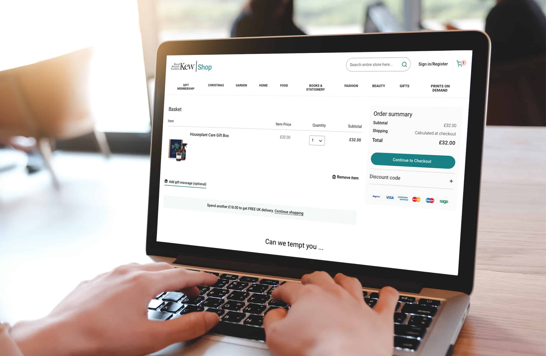
Royal Botanical Gardens, Kew
Royal Botanic Gardens, Kew (RBG Kew) is a world-famous botanic garden situated in south-west London. While RBG are a new client, they already have a great checkout process. Any available discounts and special offers are automatically applied at checkout and shown in the total cost. The checkout also calculates how much a customer needs to spend to qualify for free delivery all within the same page. Customers also have the option to add a discount code.
‘Secure checkout’ is displayed on this page to further instill trust. If a customer abandons the checkout page and removes any items in the checkout, low-cost products are displayed along with the option to click to continue shopping to encourage an impulse purchase.
Optimise your checkout to boost conversion
If you’re feeling inspired by these examples, get in touch with our team. Our ecommerce experts can review your checkout process to highlight areas where you can increase revenue and drive conversion.