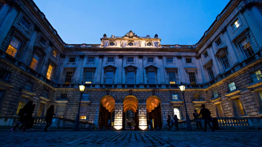
Based on the banks of the River Thames at Somerset House in London, The Courtauld Institute of Art is home to one of the world’s great collections of fine art. The institute works to advance how we see and understand the visual arts via a variety of activities, not least as an internationally-renowned centre for the teaching and research of art history.


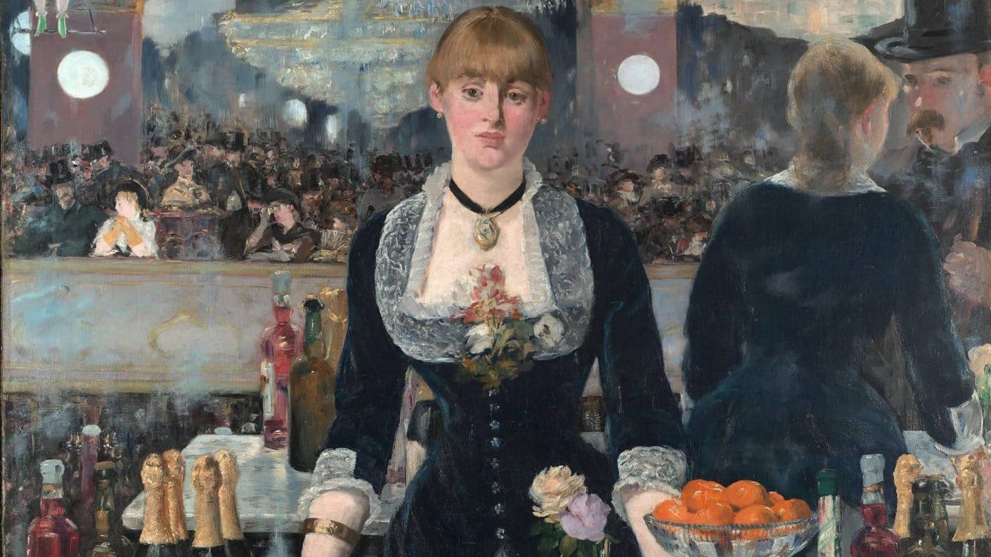
The Courtauld is also home to a major public gallery, with works from the likes of Édouard Manet, Claude Monet, Vincent van Gogh, Paul Cézanne and Vanessa Bell available to engage with and admire.
The Courtauld’s previous site was built on WordPress and was, in a word, huge. It was somewhat dour, and uninviting to wider audiences. Brand components were bland and didn’t represent the direction the organisation was going in, while the UX and design were outdated.
The user journeys on the site were ill-thought out, calls to action were sparse and not always clear and easy to follow. The content also had the potential to be enhanced and didn’t adhere to a single tone of voice. Also, the site did not fully comply with accessibility regulations.


We started with discovery and UX, defining our measurement model and carrying out user research. During the discovery process, we determined that the objective and goals for the new Courtauld site could be distilled into three main priorities: create awareness, drive footfall and increase revenue. This helped shape all our work moving forwards, while we also ran a host of interviews to get buy-in from the wider group of stakeholders.
Given the breadth of The Courtauld’s offering, and the range of audiences, we outlined a header and navigation system which is super focused on the three main navigation items, of which Study and What’s On speak directly to their primary objectives and their audiences.
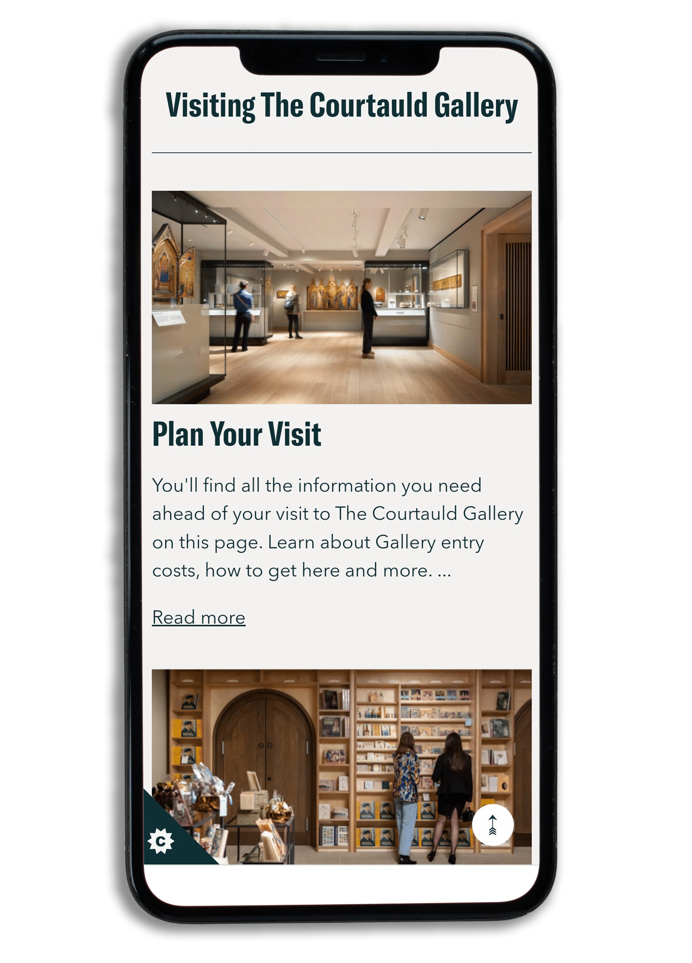
We integrated the extensive and detailed UX work with Spy’s digital brand guidelines and visual designs to produce a stunning front-end.
Next, we implemented the technology build. Like the old site, the new site also uses WordPress, but it has been redeveloped from the ground up.
Also introduced React into our build, and on the What’s On page there’s a JavaScript React app running within the WordPress theme.
During the UI phase, we ensured that all accessibility requirements were fulfilled – whether that’s typography (reading width, font size, line height and so on), colour contrast, interaction effects or another element.
Since launch, over 85% of gallery visitors are completing their ticket purchases online prior to their visit. This is bringing great benefits in terms of the visitor experience, with important visitor information provided in booking confirmations and pre-visit emails, speedy ticket check-in on arrival and reduced queuing time for on-the-day visitors.


2021

On Request

Arts & Culture
Discover how we have grown ecommerce brands online through Adobe Commerce, Magento, BigCommerce, PPC, SEO, UX, Microsoft Dynamics and system integration.
Contact us today for a free consultation appointment.
The Creative Mill
64 Mansfield Street
Leicester
United Kingdom
LE1 3DL
+44 116 326 1116
Commercial Quay
84 Commercial Street
Leith
Edinburgh
EH6 6LX
7th Floor
666 3rd Ave.
New York
United States
NY 10017
Level 17
31 Queen Street
Melbourne
VIC 3000
+61 03 8652 1590
The Corenthum Tower
B54 4th Floor
A-41 Sector 62
Noida
Uttar Pradesh
201301
By subscribing you are agreeing to the privacy policy, marketing terms and conditions and subscribing to the mailing list


© 2025 Williams Commerce. Part of the Brandwidth group